Color has definitely been THE topic for the past few weeks, with everyone (including us) revealing their color trends for 2018. Colors are ever changing, dare we say cyclical at times and for some people way too overwhelming.
We must agree that there is a comfort in the familiar, non glaring, neutral color palettes of 2018. We have stated palettes as we can clearly box them in two categories: earth tones and cool tones.  Here are our picks for 2018 :
Cool Tones
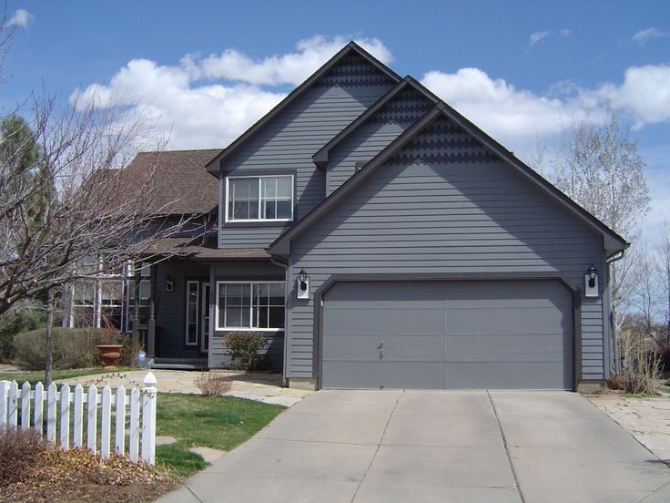
Shades of gray have steadily infiltrated the neutral realm in the past few years. Homeowners have embraced these sophisticated colors due to their versatility.
Boulder Gray
A deeper toned Gray, this color is definitely a bolder neutral. Our Boulder Gray shade has quickly moved up as a top seller in the few months it was released and we are predicting that it will remain as such for 2018. We love how the undertones in this shade appear to shift throughout the day depending on the lighting. Talk about creating visual interest!
Stonecrest
Another darker neutral color, Stonecrest is a mid-tone gray with a tinge of blue. Incredibly versatile color, this shade can suit traditional and modern architecture. Combining this neutral with white will create a clean crisp look, and pairing it with darker trims will add a touch of brooding drama. This color exudes sophistication without being overbearing.
Flagstone
Flagstone is a mid-tone gray mixed with blue undertones. This color can handle bright, vibrant accessories without being overshadowed, perhaps a red door, spice colored gables or deep blue shutters, let your inner artist be inspired. This cooler, stormy neutral will enhance your home’s beauty by creating the perfect backdrop.
Earth Tones
Pulling from various warm shades, earth tones are normally muted and soothing. Colors in this palette work well with a multitude of tones.
Sandalwood
Sandalwood is a light neutral with extremely subtle reddish-brown undertones. This quiet color will marry well with darker earth tones, use these to highlight your home’s architecture without distracting from its delicate beauty. This timeless color will never look out of place and will remain classic go-to shade.
Beige
Beige is a classic, no-nonsense neutral color. This color is a bit lighter than khaki but offers all its warmth. This mid-tone shade creates a pure, calming canvas which can be dressed in a multitude of ways. Pair it with natural colored trims to bring forth its organic side. Combining it with dark contemporary colors will make these shades stand out even more.
Khaki
Khaki is a wonderfully unobtrusive neutral. This deeper earth tone, can be found in almost all our collections. This shade can suit all types of homes, making it consistently a top selling color. It can be dressed up with bold trims and accents or paired up with neutrals to further enhance its softness. Embraced its comforting versatility.
Don’t think of neutrals as the bland, safe choice these shades reveal their full complexity with their undertones. Remember to take these into consideration when choosing accessories and accents.
Whether you choose cool or earth tones, we are sure these colors will be the front runners for years to come no matter the trend.


